Biped Animation- Run Cycle #1
- Maggie Chan

- Dec 21, 2019
- 6 min read
Updated: Jun 7, 2020
2nd year (1st Semester)
Assignment- Animation strategies
For my 2nd assignment for this semester, I am to create two biped animation; one being either a walk or run cycle and second a body mechanics (the physical expression of motion) in 2D or 3D.
Run Cycle
Plan:
At first, I thought I should go down the 2D direction since I did a similar 3D walk cycle the year before but after giving an animation rig model (AZRI) to animate in 3D with I thought it'll be nice since this time I have the upper body to worry about as well. I also decided to go for a run cycle for the same reason.
To begin I went back to my feedback for my walk cycle from last year to see what specifically I lacked-
Last year feedback: I need to improve on conveying the action by making the movements more exaggerated.He continues, I should take more time spent on it certain areas to make the action clearer and I should keep in mind to make the loops longer so the viewer has more time to read them. Also, I should take a look into Keith Lagno videos.
Taking that into consideration I hope to see some improvements at displaying the action more clearly.
Research/Material:
For timing, I will use the same information (as shown below) from last year as my guide as it had previously helped substantially with my timing. For the run cycle according to the guide, I will plan to work in 6 frames to achieve 4 steps a second.

Reading:
Some great points I paid extra attention to:
Richard Willaims- Animation survival kit:
-For runs, both feet are off the ground at some point for 1,2,3, positions -Rule of thumb: for the up pose, only raise 1/2 or 1/3 head never the whole head as it can be too much -the faster the figure runs the more it leans forward
Steve Roberts- Character animation
-Making it faster will result in a fast walk. Instead, longer strides are used to create a run -the twist is an exaggerated version of a walk -for the jump, the feet are off the ground -the stride is the jump so more exaggerate squash for jump
Video reference:
The most helpful resource that got me startup was, 'I Want to Be an Animator by Animation Tutorials'. It's straight forward and covers most of the components such as using motion trail to guide you, motion blur for smoothness and so on.
Keith Lango- notes: mainly VTS 42 to 47 also VTS 25 and so on.
-Keep your graph as clean and smooth
-Just because a part of the body isn't in the frame doesn't mean you don't need to animate it. Keith Lango VTS45, 'even if we don't see it we'll feel it'. It will also ensure you are animating it right.
-Give more depth than just a straight expression
-Most importantly to 'stop and think' before you do anything.
Exploring characteristics/personality:
Notes of my research from reading articles and my observation:
-Wider strides, stronger arm movement, stronger twist: Bold, full of energy
-Shorter strides, little arm movement, less twist: Timid, graceful
-Slower: heavier, relax Faster: lighter, in a hurry
Details of my character:
Gender: female but not feminine Character: good energy in the run, fit, devious, running away-not to be caught, terrified in an amusing way.
3D rig: model AZRI (created by GameAnim)
For this assignment, we were given a model, 'Azri' to work with. To begin, Alec advised us to create some poses with the model to get used to the mechanics.
Below is a basic jump cycle I created during my class to get used to the controls and working with the graph.

Process:
As always before I start I tend to start by the basics first to get myself into the whole progress especially if I haven't attempted it before.
Startup 'normal' run
Great side view run reference video by EMU Running Science Laboratory that demonstrates the shapes and lines very well clearly.
They also have many videos in different perspectives which were insightful for the movements of my character especially the twists in the pelvis.
To start off in order to block out the poses accurately, I used a reference image with human proportions from Richard William's 'The Animator's Survivor Kit'.

After setting the poses I started tweaking the graph e.g referring back to the reference video, experimenting the tangents with the spine, and linear tool etc. until I was satisfied with the overall look and feel.
To work more efficiently for this run, I worked on 12 frames (2 steps per sec) then I drag it back and duplicated it to make it on 6 frames (4 steps per sec) for a 'run' according to Richard Williams', 'The Animator survival kit'. This worked perfectly and I plan to follow along these lines for my character run.
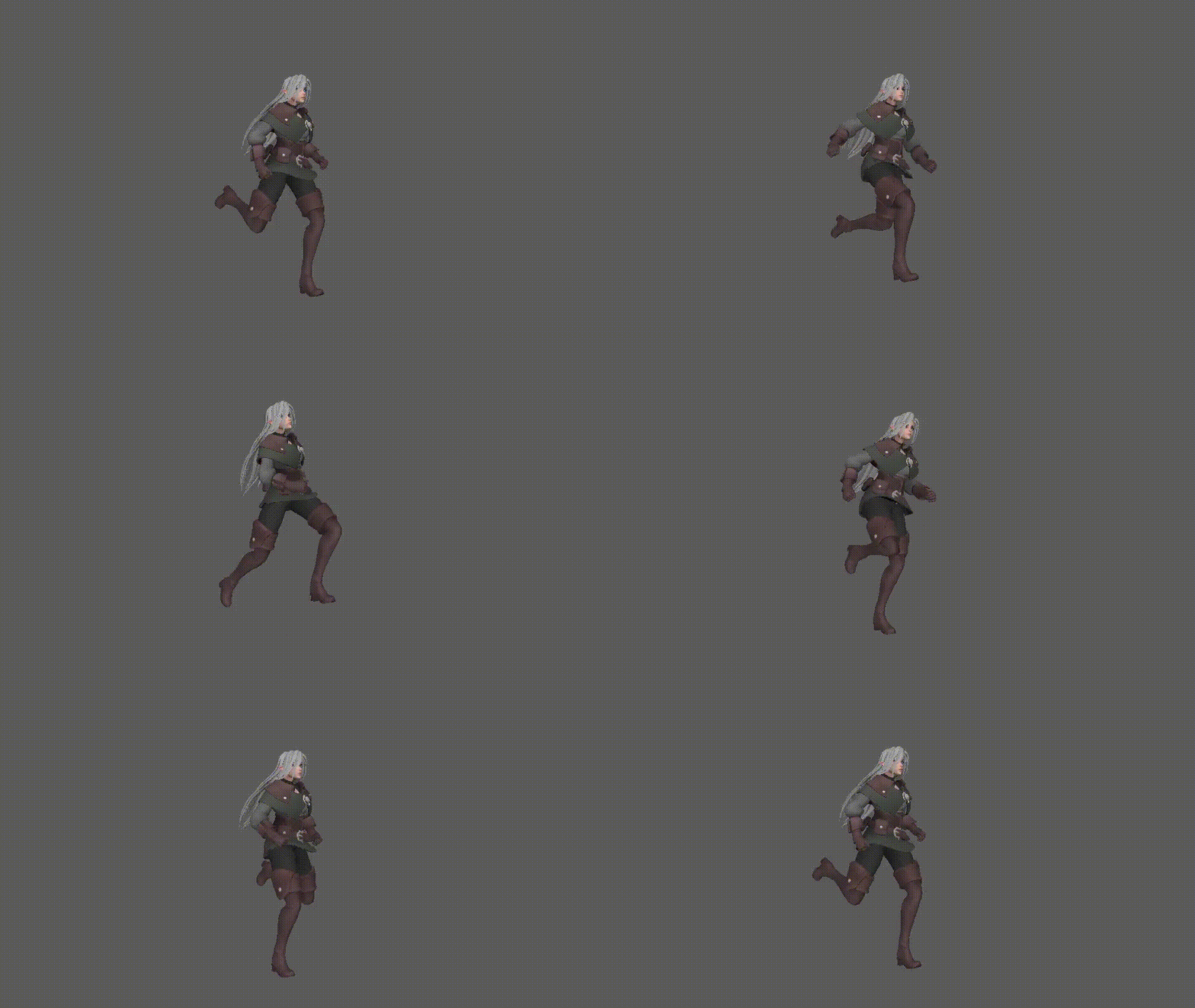
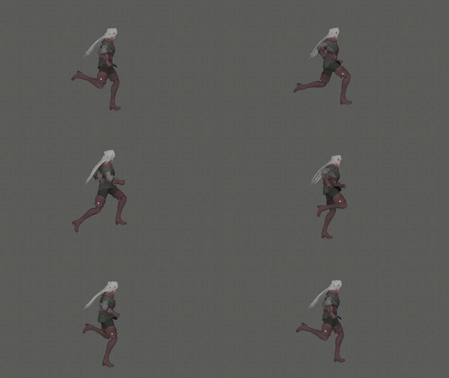
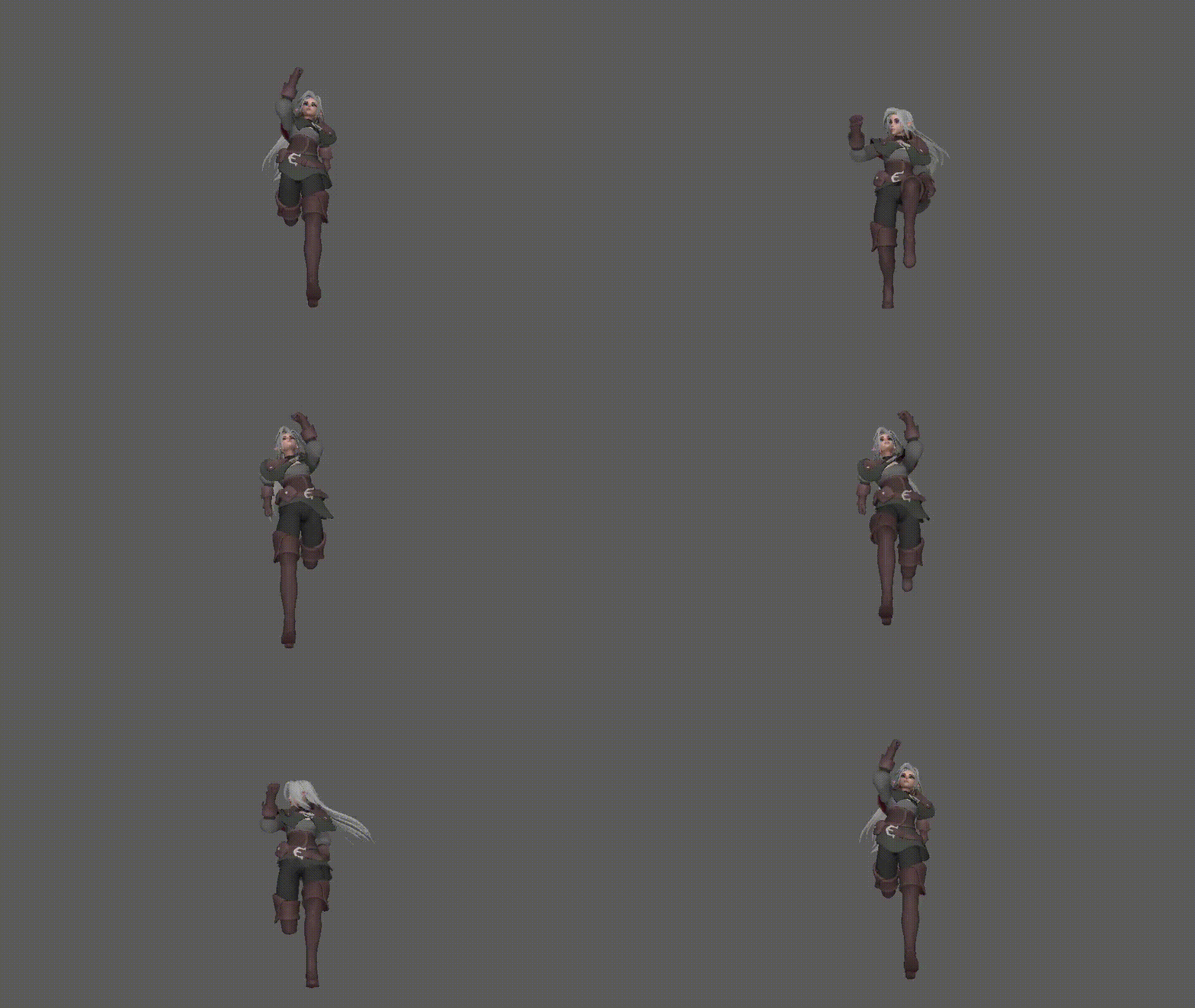
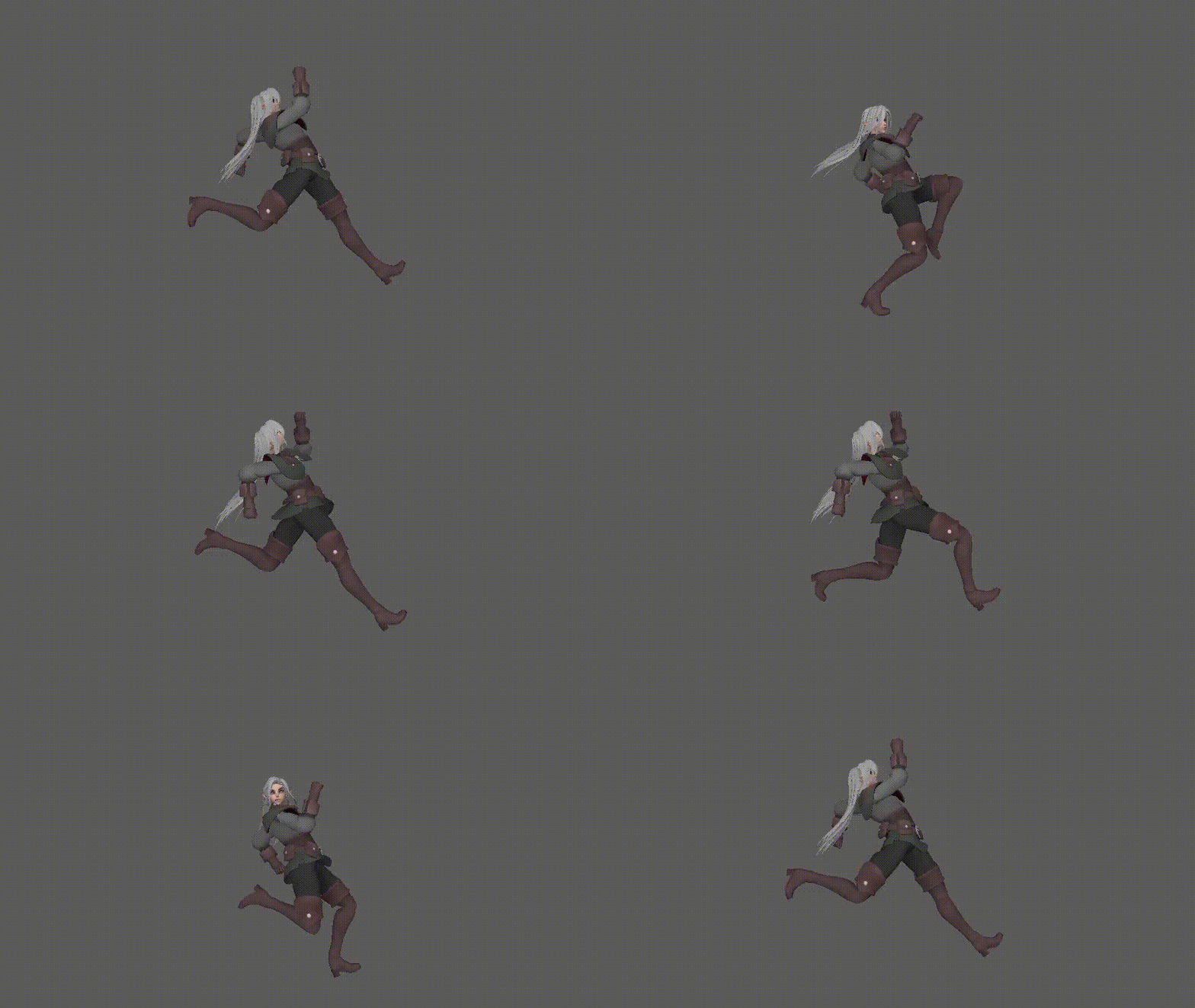
Finish 'Normal' run cycle: front, 3/4, side view
It's not perfect but it did help me get more comfortable with the technique/method of creating a run cycle.
Run Cycle (with personality)
Now with more understanding of the timing and movements. I started adding personality into the run.
For this run, as mention before I wanted to achieve the impression of a devious character wanting to get away from something she did by using all her might to run. Therefore her strides are at its widest and her upper body will drag back as the legs lead it.
A great video reference by Nolan Woods: at 0:10 Tom running away
For this video, I'd focus more on the upper body as I intend to have the lower legs more apart from each another. From this video, the animator approaches this by having his upper body in a constant pose except when he was looking over his shoulder. His lower body is taking most of the action. I intend to exaggerate mine further and have her arms swing/move in a steady but fast speed as they tend to have a straight-on action when they are in a hurry.
For a more specific reference, I used a cycle layout from Character Animation (2D skills for better 3D) by Steve Roberts p.130 as my guide for how each keyframe poses should look like. I used blocking pose to pose for my method, I find it simpler than doing it straight ahead as it gives off a more consistent look which I fancy.
Character Animation (2D skills for better 3D) by Steve Roberts p.130.


As she faces forward I tilt her head upwards as her upper body is stretch behind. I also made the character look back over her shoulder checking if her chaser is close by. This wasn't influenced by my reference as I had it mind from the start as I wanted to express her cunning nature through her expression as she looks back at the people she deceived to getaway.
I tried to exaggerate the movements as much as I can. For example, I brought her arms higher, made the stride wider, more lean back and twist the hip more diagonally. However, I made sure not to break the (Richard Williams) Rule of thumb; don't try to raise the head over 1/3 of a head in the up pose as it could be too much. A tip I mentioned before from my research.
Furthermore, I played around with the character's expression to emphasise her character as well as the situation she is in:
A tip (stop and think) from Keith Lango that helped me to be more time-efficient was to identify and list all the details need to be fixed from a preview then fix it and move on. This prevented me from continuous going back and forward fixing one at a time which saved me a lot of time.
Ensuring the motion trail is smooth:


Feedback:
Using the site sync sketch I was able efficiently to get constructive feedback from my lecturer (Alec). He said the overall run was good and he could tell there was some character going on. One of the issues of my animation is that the head movement is a bit jerky so I need to go back and smooth it. As for the arms, I need to try pushing the arm out further to create a more defined arc of motion of the arms around frame 5.
Now realizing that I quickly went back to frame 5 and followed the outline as shown below also ensuring it has a nice curve arc motion. From what I see is that the arms have a bit more sharp swing to it. Next I for the unsteady head movement; The problem was I have too many different movements in such as a short time so I tried taking out some keys to keep it more linear and using spline tangents to smooth it out the best I can. I also cleaned my graph a bit more as it was a bit out of the frame number (e.g fixing frame 4.2 to 4). I also showed my classmates for critique but they were happy with it. The improvements are subtle but it had a great effect, on the whole, feel of the run.


Final cycle:
Front, 3/4, Side view Gif.
Self-reflection:
I tried the best I could therefore I am content with the outcome. I think I display the action well. I feel like my technique has developed as it's much cleaner and sharp. It looks smooth from my perspective and it was fun performing with the facial expressions. However, it was a lot more difficult from last year as I had to go back and fix the hair and clothing as it was colliding with the arms and legs. I also didn't exaggerate it as much as I didn't want it to overdo it and come off unnatural. Maybe if I went with a more cartoony approach I could get away with it but for this, I aim for a more realistic route. For future improvements, I will take some time practicing other types of runs/walks and look more into other areas such as the hair and clothing.


Comments